Wednesday, June 13, 2007

My only claim to fame

DeadRobot just alerted me to the fact that I was - once again - a poster boy for The Black Eagle Toronto. You'd think they would have found a clearer picture to use. You'd think I'd get paid or at least a free drink. Not to mention that site looks like utter shit. A direct product of Dated Websites for Dummies Using Frontpage 2.0 for Windows 95. Hell, even I could have done better.

Poster:


Me (I'm having my leg measured for raffle tickets):

Sunday, June 10, 2007

70's Ads

What happens if you wear it and you're not gay?

These chicks are into hot bareback action.

A. It's O.J.
B. He has a third leg. Literally.

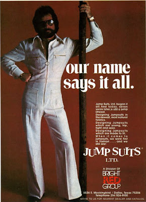
Jump Suits Ltd. 'Nuff said.

<-- Not Sexy ..... Not Sexy -->

Levis. For little boys who dream of swinging alone to the pink tiger.

Go Walk Your Dog

Friday, June 08, 2007

First Draft


Going to be creating some pictures along this theme. This is just a rough idea, not sure what the final product will be like. Just wanted to put it out there. Aiming for the fall.

Thursday, June 07, 2007

Not Suitable for Some Viewers

As if the Olympic logo wasn't hideous enough, it's now come to light that the promotional video for it can cause seizures. Even people who hadn't had them for years were being triggered by this awful piece of promotional trash. Talk about adding insult to injury - or in this case injury to insult. It has since been taken off their website, but you can still find it here.

WARNING - If you are prone to seizures and Dickeybird THIS MEANS YOU, don't watch it (unless you want the rest of the day off). I did and even I had to avert my eyes a couple of times - especially the part when the diver jumps in the pool. It even left me feeling a little odd for a minute or so after watching. I find it hard to believe that no one noticed anything unusual during the screening process (assuming there was one of course).

You know, the more I think about it, the more I have to give kudos to the agency that created it. It's definitely unique, it's recognizable, it's unforgettable, everybody's talking about it, and even though it doesn't look like it has much to do with the Olympics, thanks to the media everyone knows that it's associated. I'd have to say that they did their job well - hideous or not.

I'm going to go take some Advil now. I've got a headache. You've been warned.

Monday, June 04, 2007

Logo me this


This is the official logo for the 2012 Olympics. I may be an artistic hack, but I know shite when I see it. Florescent pink and yellow? Hello? 1988 called and they want their logo back. Ech. Apparently it hasn't been well received.

Best comment I've read so far:

"Lisa Simpson giving head is the official 2012 London Olympic logo!"

Didn't see it until I read that - and now it's all I see.

Thanks to Knife Writer for the quote.